This Venn Diagram from New York Magazine shows an incredible amount of overlap in the titles and themes of various reality show.
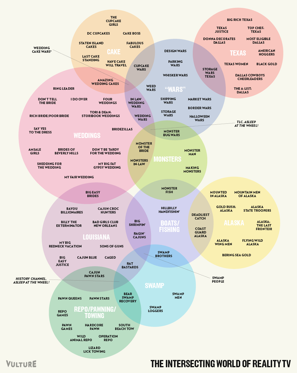
Here’s the big version.
Based on a true story
This Venn Diagram from New York Magazine shows an incredible amount of overlap in the titles and themes of various reality show.
Here’s the big version.
Afghanistan – touch down in flight by Augustin Pictures
As each of us has his own impression of Afghanistan that is predominantly marked with pictures of foreign forces, explosions and terror, we were privileged to have access to capture daily life and portrait some people of Afghanistan.
Be sure to watch it in full screen.

If there’s no good reason to use the feature, why have the feature?
(by Jason Robb)
Rand Fishkin from Moz and Dharmesh Shah from HubSpot launched a Hacker News like site for marketers, Inbound.org.
I hope the community and content quality of this site is up to the standards of it muse.

(via Why I want to quit cable)


The method of creating this Anatomical Cross-Sections in Paper is quite fascinating:
These pieces are made of Japanese mulberry paper and the gilded edges of old books. They are constructed by a technique of rolling and shaping narrow strips of paper called quilling or paper filigree. Quilling was first practiced by Renaissance nuns and monks who made artistic use of the gilded edges of worn out bibles, and later by 18th century ladies who made artistic use of lots of free time. I find quilling exquisitely satisfying for rendering the densely squished and lovely internal landscape of the human body in cross section.
[youtube http://www.youtube.com/watch?v=8h-C6u4yLj4?feature=oembed&w=250&h=140%5D
A Brief History of Computing Platforms (by AsymcoInteractive)
Read more about the background of the analysis.
Pop Chart Lab has this detailed diagram of many classic cocktails.

This definitive guide to classic cocktails breaks down 68 drinks into their constituent parts. Follow the lines to see where spirits, mixers, and garnishes intersect to form delightful concoctions. This massive movie poster-sized print contains over 40 types of alcohol (from distilled spirits to bitters), mixers from raspberry syrup to egg white, and garnishes from the classic olive to a salted rim. This obsessively detailed chart also includes the ratios for each drink, as well as the proper serving glass, making it as functional as it is beautiful. Over a year in the making, this is Pop Chart Lab’s most elaborate chart ever.

Rules of engagement. I think I may need to make these a wallpaper or transcribe them onto a Post-It or something.
Remind me about it tomorrow, OK?
[via girldefective: iateabee]