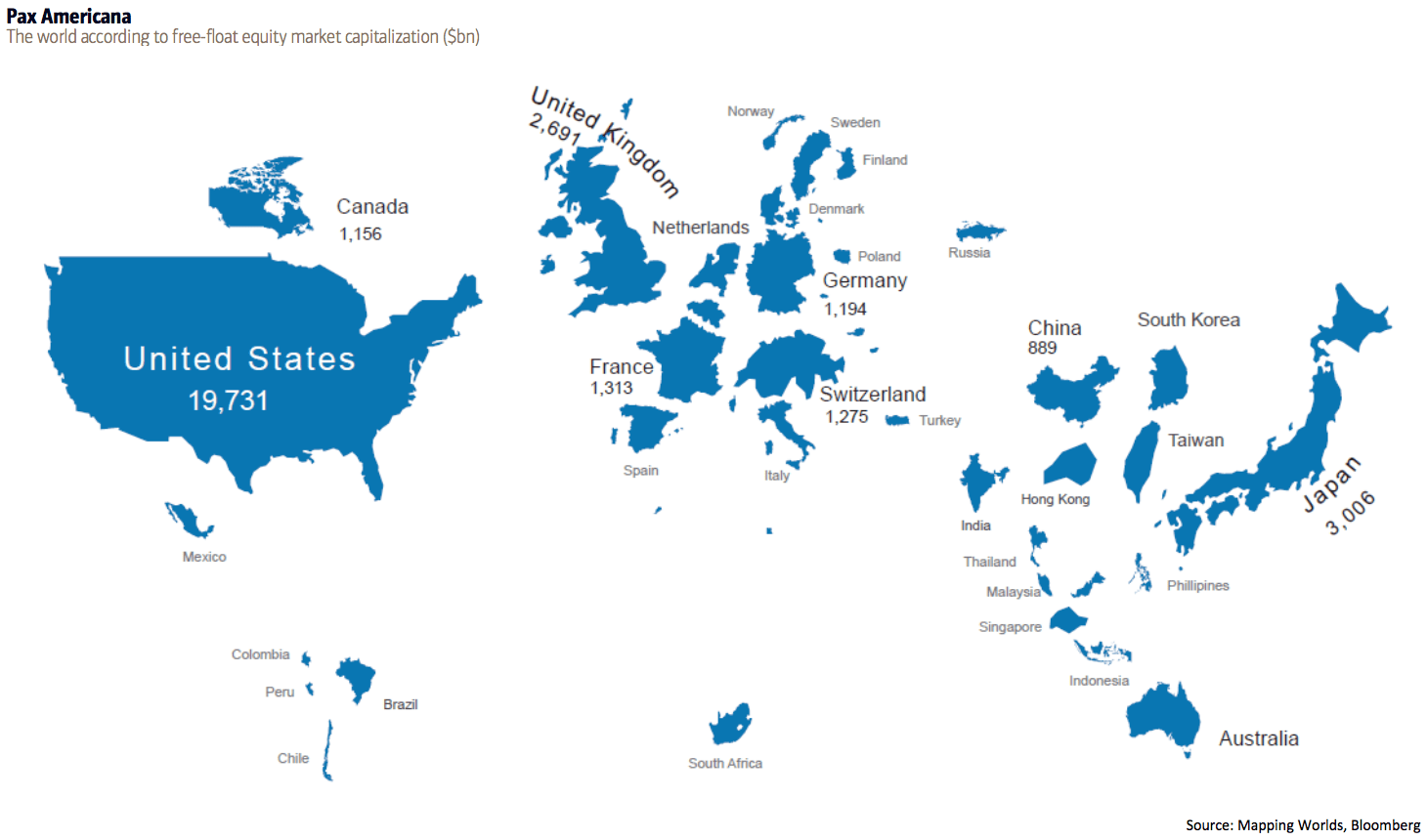
This world map shows countries by the proportional size of their stock markets.
Created by Bank of America Merrill Lynch’s Chief Investment Strategist Michael Hartnett, this illustration shows “free-float equity market capitalization” in billions of dollars.
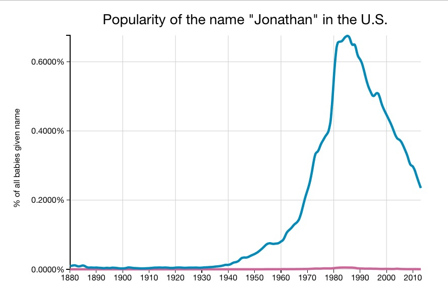
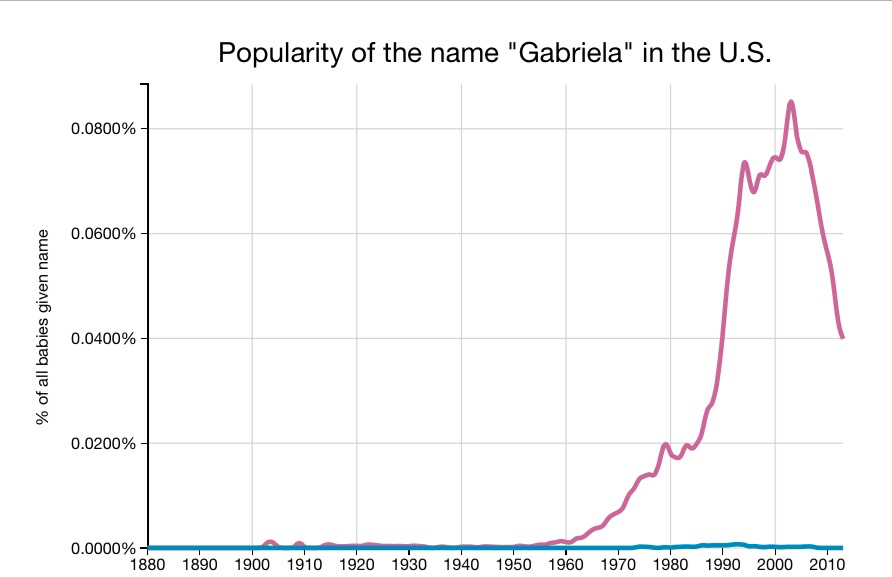
The webapp, Baby Name Explorer, lets you see a graph of the popularity of baby names over time. The site was created by Randal Olson, a researcher at the University of Pennsylvania Institute for Biomedical Informatics. The app makes it easy to see when common baby names were most popular.
It looks like my parents picked my name right at he height of its popularity.
However, I don’t feel like I encounter that many other Jonathan’s. On the other hand, my in-laws picked a name well ahead of its time for my wife.